With the Knicks and Nuggets both dropping a little earlier than expected this playoffs season, there’s been some talk about the risks of leaning too heavily on your stars. As the theory goes, you can’t win a title in today’s NBA without depth. Malone and Thibodeau seem to have developed a reputation for riding their star players like the family station wagon. Is this the right move?
I buy the logic. The NBA season does look a lot more like a marathon than a sprint. Yeah, compensation is generous. That’s not a valid excuse for pushing or even allowing players to push themselves beyond their limits. Athletes competing in top form and living long, healthy lives outside of their careers seems like the right move. But what if we’re only concerned with winning…
Did the Knicks and Nuggets really just run out of gas? Is resting your starters adequately a feature of a winning title bid?
Everyone seems to have an opinion. What I haven’t been able to find is compelling data. This is my attempt to remedy that, putting some numbers on minutes distribution.
We can start with the graph. It’s the fun part. After, I’ll get into how I assembled the data, and some potential .
A Quick Rundown
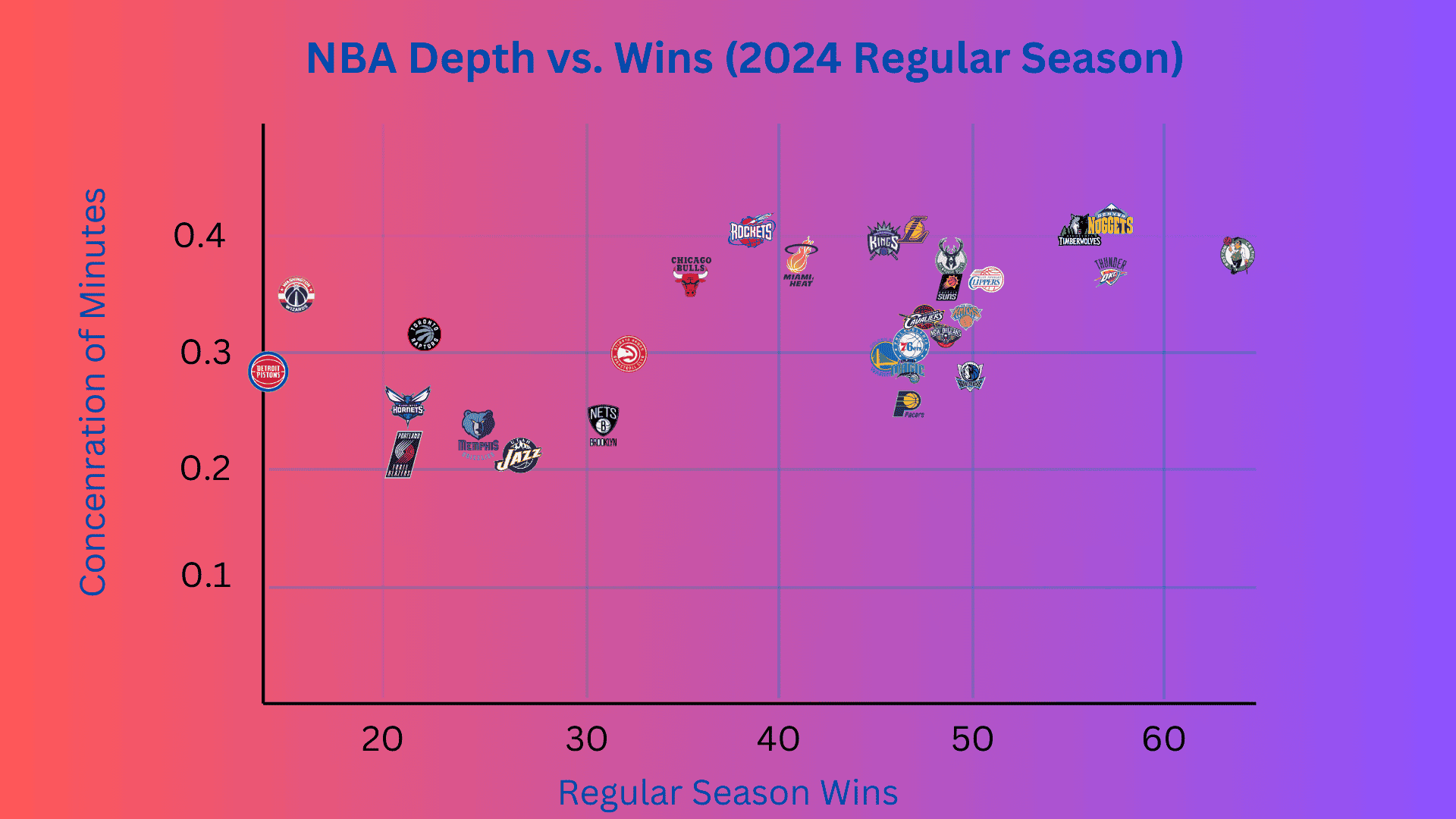
To the right, you find the teams with the most wins in the 2024 regular season. To the vertical are the teams that asked the most minutes of the fewest players.
There’s a clear trend. The teams that leaned harder on a smaller set of players over the course of the 82 game season are generally the teams that were more successful.
Somewhat obvious. If you play your starters, you win games. But is there any indication that the trend holds if you continue riding that same set of players through the playoffs?
I’d make the case that it does. It’s a little complicated how I get there.
The Gini Coefficient Applied to NBA MP
We need an effective way to describe the distribution of playing time for an NBA team. It’s simple enough to get data on Minutes Played or Minutes Per Game across a series or a season. Interpreting that data is less straightforward.
There exists a formula known as the Gini Coefficient. This formula is used to quantify economic inequality. A full proof is well beyond the scope of this article. But a quick conceptualization, in basketball terms…
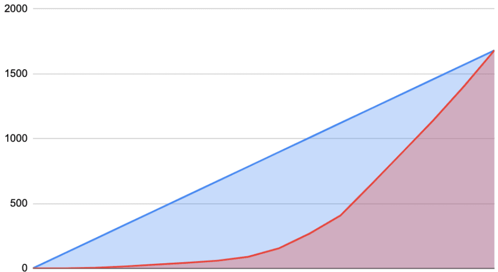
Here’s a table of minutes played across Denver’s roster in the 2024 Denver vs. Minnesota playoffs series.
This graph describes the cumulative sum of that data, ascending from least to greatest.
A bit confusing. So let’s walk through the graph…
The red line starts at 0. As we move to the right we add each player’s minutes to the total, in order of how many minutes they played throughout the series. At the top right corner, you hit the total minutes played across all players on the team for the entire series, which is 1681.
Now the blue line. The blue line is the straight connection between 0 and that final total of 1681. This line describes the theoretical case where minutes are evenly distributed and every single player on the roster sees the same amount of court time.
Great. What’s the point?
Well, it turns out that if you calculate the ratio of the area between the blue and red lines to the total area under the blue line, you get a number between 1 and 0 that describes the distribution of minutes played. The closer the red curve gets to the blue, the closer that number gets to 0 and the closer we get to an equitable minutes distribution.
That means that if you run this calculation on any distribution of minutes, you should end up with a single data point and that data point should be a good indication of how generously playing time was distributed.
I wrote a Google Sheets script to make it easy to run the calculation across minutes data I pulled from BasketballReference. Happy to provide the script to anyone who is interested. Just send me an email or something.
Note: In this case, I enforced a 15-man roster. So teams that did not play their entire available roster do get penalized with extra 0’s. That is, you can’t just play your 5 starters all game and get a perfect score because your score would be calculated as ten 0’s and five 5’s.
The Data
Using the formula, I looked at the equity of minutes distribution across NBA teams and its correlation with success. We can debate just how valuable the formula is in this context, and we’ll get to that, but the calculation does describe the equity of minutes distribution.
So now we can take a look at the data and see if here’s any correlation between equality of minutes distribution and winning.
Regular Season Data
First, the regular season. There’s a fairly obvious trend here. A more equitable distribution of playing time does appear to translate to more losses.
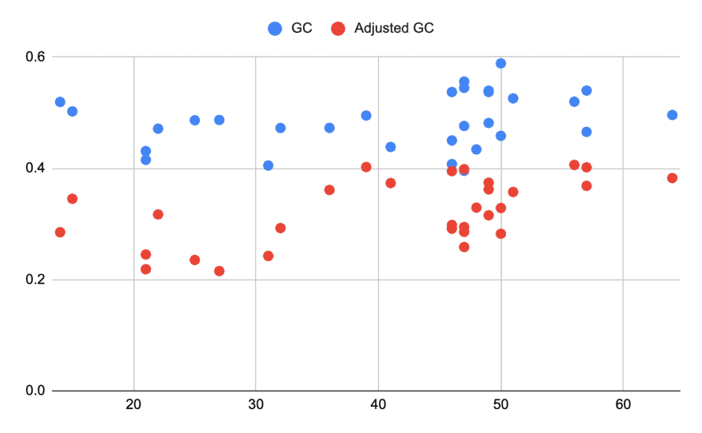
The graph shows the number of 2024 regular season wins on the x-axis, and the calculated Gini Coefficient for Minutes Played along the y-axis. Each dot represents an NBA team.
Blue dots represent the calculation across the entire roster, every player that played any minutes at all for that team across the regular season. The red dots show the calculation when limited to only the 15 players who played the most minutes across the regular season. The red dots are the data points shown in the team logo graph at the top of this post.
The trend gets stronger when you limit the data to the top 15 players. I do believe this is justified. It kicks out those players that are just coming up for a short test run.
A lower position on the Y-axis suggests a more equitable distribution of minutes. This means your team probably saw more bench minutes, possibly an injury to a star player. These teams do appear to have had a tendency to fall lower in the wins count.
You can see the Pistons and the Wizards off to the left there, breaking the mold in going to their starters and still losing. But, in general, the trend is up and to the right. The trend is more apparent for the red dots, limited to the 15 most frequently deployed players on a team.
This suggests that keeping your best players on the floor does translate to regular season wins. I don’t hear many good arguments against this.
I do, however, hear the argument that it could be valuable to give up some regular season wins by resting your star players in preparation for the playoffs.
Specifically, I’ve heard the suggestion that resting Jokić, even if it meant dropping to the third seed, could have left him enough extra fuel in the tank to make a difference in the Wolves series. And I’ve also heard the argument that Thibodeau’s roster management is what set off the injuries that tanked the Knicks’ season. And finally, I have heard that a reluctance to set aside enough playing time for your prospects can stunt their growth and limit your options in the playoffs.
Playoffs Data
To look at whether this calculation has any correlation with playoff success, I took a less graphical approach.
The table below describes matchups for each playoffs series through round 2 of the 2024 playoffs. Winning teams are on the left. For each team, I calculated the Gini Coefficient for Minutes Played (let’s call it GCMP) across the series. I then subtracted the losing team’s value from that of the winning team.
So, the discrepancy column lists the difference in GCMP. A negative discrepancy means that the winning team had a more equitable minutes distribution than the losing team.
The RS discrepancy is that same difference calculated across the regular season as opposed to just that series. So a negative RS discrepancy means that the winning team had a more equitable distribution of minutes across the regular season.
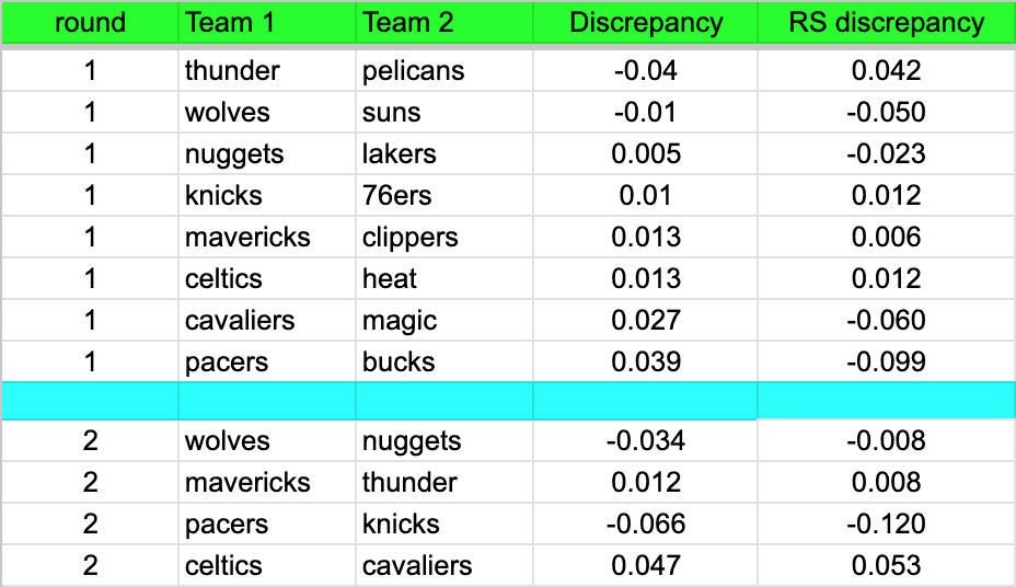
I don’t see a correlation here. Yes, the Knicks and the Nuggets both had a less equitable distribution of minutes across both the regular season and the playoffs than the teams that sent them packing. With the Nuggets, that difference was minimal. And the winners of the other 2 second round series’ both showed a worse distribution of minutes across both regular and post-season.
When you limit the roster to 15 spots, these are the teams that had the worst distribution of minutes during the regular season.
| celtics | 0.383 |
| kings | 0.395 |
| lakers | 0.399 |
| nuggets | 0.402 |
| bulls | 0.402 |
| wolves | 0.406 |
That’s an impressive set of teams. The Bulls and Kings dropped in the play-in, and the Lakers dropped in the first round, but these are all technically playoff teams.
I will note that the Pacers and Mavericks both made it deep on a comparatively equitable minutes distribution. They came in at positions 6 and 7, respectively, in terms of minutes equality. However, no team that shows up at positions 1-5 even made the play-in.
Conclusion
A lot of this is up for interpretation. You can still argue that Malone and Thibodeau might have helped their teams chances by better managing specific players: Jokić and Murray, or Brunson and Anunoby.
And I suppose you could try and argue that the Gini Coefficient itself doesn’t have a strong application here. It is a statistic that was designed for larger data sets.
I’m convinced though, that playing time management is not a singular factor in 2024 playoff success. In fact, it’s looking pretty clear that keeping your best players on the floor as much as possible is the only correct choice. If this were not the case, I would expect to see a massive drop-off in success for teams that clearly lean on their starting lineups.
Focusing on the Nuggets and Wolves matchup. Those teams are both very closely grouped on the graph. In my interpretation, this effectively eliminates minutes distribution as a factor in that series.
The narrative has been somewhat common that the Wolves are a deeper team, and that Finch is a coach who is more generous with playing time. The data doesn’t back this up.